Alura2025
Retrô 2025
A feature that turned each student's learning journey into a personalised and inspiring year-end review.
- My role
- Product Designer: UX strategy, user flows, visual design and design deliverables
- Client
- Alura
- Release
- Alura Platform · December 2025
- Teams involved
- Design, Dev, Copy, Marketing
- Reach
- 3K+ users accessed the live feature
- UX Design
- UI Design
- Website Design
Context
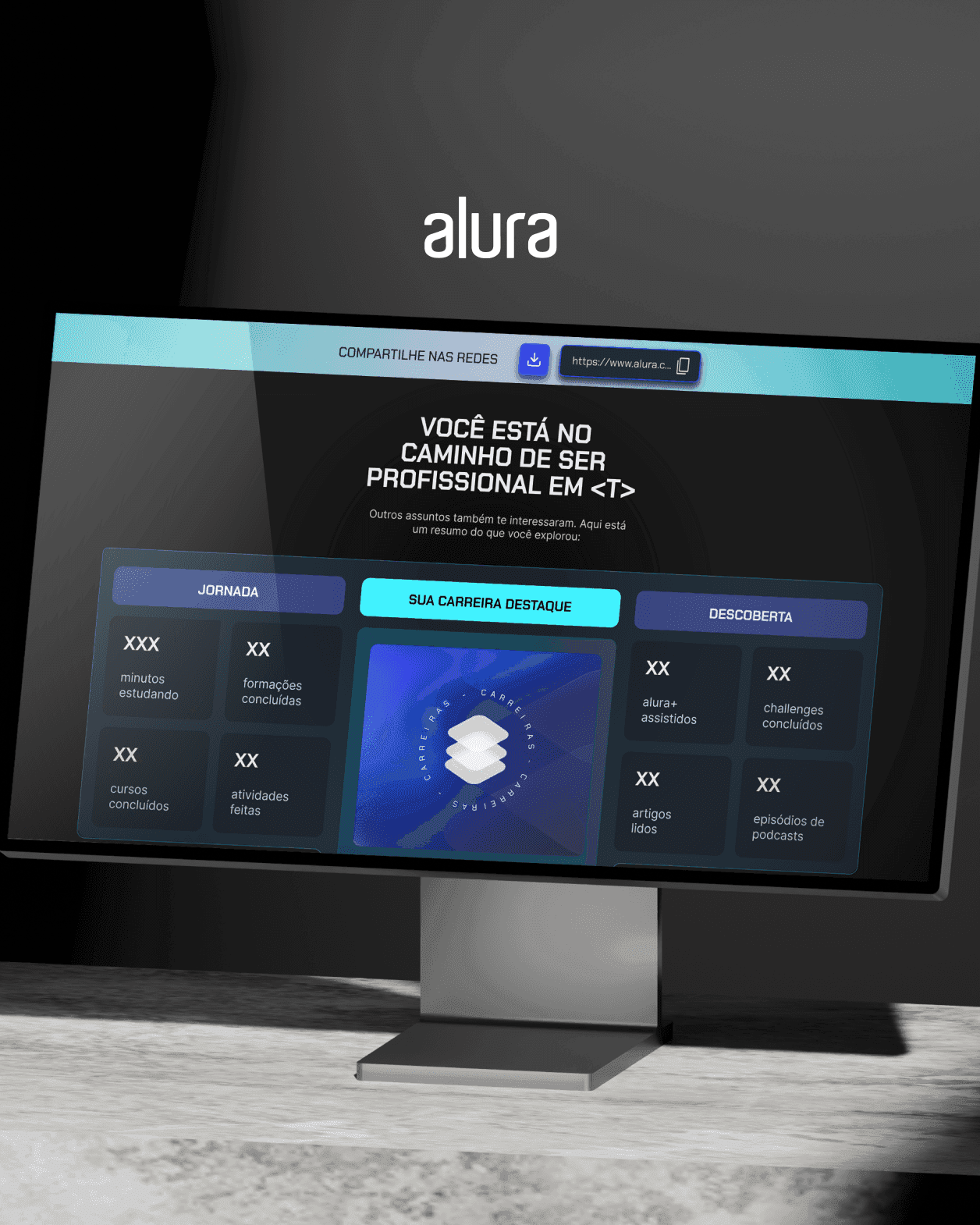
The end of the year is an opportunity to celebrate students who invested many hours in studying. Retrô 2025 is a personalised annual recap in the spirit of Spotify Wrapped: it shows each person their achievements, courses, study days, career paths and more.
The aim was an emotional, shareable experience that builds connection, pride and social engagement, reinforces the Alura brand and recognises each student individually.
The challenge
- Product challenge: deliver real perceived value by telling an engaging, personal story of each journey, not "a dry data report".
- UX challenge: turn usage metrics (study days, courses, tracks) into strong visuals with a clear hierarchy that are easy to post on social media.
- Technical challenge: handle dynamic, per-user data while staying fast and scalable for more than 3,000 concurrent users.
Project constraints
- Tight, year-end deadline
- High expectations for social sharing
- Data specific to each user
- Tone of voice aligned with Alura
- Fully web-based, on desktop and mobile
Teams & collaboration
- Product Designer: UX strategy, flows, visual design and deliverables.
- Dev team: built the feature and connected it to real user data.
- Copy team: wrote the texts and shaped the tone of voice and the emotional narrative.
- Marketing and SEO team: social outreach and amplification strategy.
Design process
How we built the solution.
- Discovery & benchmarking: studied Spotify Wrapped, GitHub Year in Review and Duolingo Year in Review to learn their sharing patterns, story structure and emotional triggers.
- Defining content with Copy: decided with the copywriters which data to show, the order of the story and how the tone moves from emotional to motivational across the cards.
- Wireframes & user flow: mapped every screen in Figma, from the landing page to the final share card, set the information hierarchy and designed small moments of surprise and celebration.
- Visual system: dark mode, neon blue #2A35FF and cyan #3CF2FF, the Chakra Petch typeface and gradients for a futuristic, tech look consistent with the Alura brand.
- Handoff & delivery: Figma documentation with technical specs, named components, states and design tokens, plus close work with developers during the build.
The feature in action
Every student gets a unique journey covering study days, career path, course progress and a personal congratulations message.

- Personalised for each student: everyone sees their own photo, name and data. The feature is entirely dynamic.
- Gamification & celebration: trophies and badges reinforce the feeling of accomplishment.
Impact & results
3,000+ students accessed, downloaded and shared Retrô 2025, creating organic buzz on social media.
Where the effect showed up
- LinkedIn: students posted their results, and those posts drew above-average engagement.
- Instagram: stories and posts used the Retrô card, the #Retro2025 hashtag appeared spontaneously and Alura's follower count grew organically.
- Platform: a strong completion rate, share-card downloads, user-generated content and inactive users coming back.
Retrô 2025 became a cultural milestone for the Alura community, proof that products with emotional appeal generate genuine, organic engagement.
Lessons learned
- Data + emotion = engagement: an emotional narrative is what turns a report into an experience. Design should guide people through the story their data tells.
- Customisation at scale: templates must handle variable data and keep their identity, which demands careful attention to edge cases.
- Speed with quality: with tight year-end deadlines, focus on what most affects users and leave the non-essentials for a later iteration.
- Multidisciplinary collaboration: continuous alignment with Copy, Dev and Marketing from day one kept every element working together.
- Design for sharing: planning for virality early reshapes the design. The share card was core strategy, not a detail.
- Metrics as a compass: setting KPIs before launch was key. More than 3,000 visits and strong sharing rates validated the product hypothesis.
Next steps
- Advance notification: alert students when Retrô goes live to amplify the launch-day spike.
- Video format: automatically generate a personalised video for each student to boost social sharing even further.
- A/B testing narratives: compare story angles (courses vs. days vs. career) to find which resonates most.